- first shot is confusing
- lead singer not convincing
- lip synch lacks momentum
- shots not framed well
- end shot is good
- idea not communicated well
- how do we know the boy is the lead singer
- mise en scene doesn't work
- complete rethink
- include more inspiration
Friday, 28 October 2011
Draft Video Feedback
This is the feedback that our teachers gave to us for our draft music video.
Draft Video
Our Draft Video, we have already been through the video- we know what parts we need to reshoot.

Thursday, 27 October 2011
Band Picture

Wednesday, 26 October 2011
Actors


 |
| Katie will be playing the Mum in our video. |

Scott will be playing the younger version of the lead singer in our video.

Henry is playing the dad in our video.
Saturday, 22 October 2011
Album cover ideas

I think this one is complex when looking into the cover, because of the use of colour-there are 4 colours on the cover- the key 2 being the gold and the black, the back ground colours being the pink and greens. In my mind this alone tell's its own story-following the portayl of the song we are doing (that although there are darks, there is always something light)

This in it's own tells the dark story- with the gold being the only true colour in the image.

This image has 3 clocks and 3 colours. The gold of the clocks (showing the importance of time). The black of the numbers and the greens of the natural light.

Here there are 2 colours. I like the impact the title of the album has upon this image- also the apple in the tree. There are in total 4 clocks and one tea pot- strange as this maybe is this not the mockery of time?

This is a very simplictic image (still using 3 colours). The editing done on the image creates the noise on the hands of the clocks. I think the idea of time has a strong impact upon this. The centre of the clock is in the centre of the swirl-

Againg simplistic in terms of colours but also the image it self. The apples in the back ground bring the thought of nature to the image and the pocket watch personally makes me think it is more personal. Therefore engaging the buyer with the band.


I don't think that this font works well with the font on the clocks.

The title on this cover doesn't stand out enough for me- we have the ageing of the leaf- linking with time in the back ground but also the pick from the roses.

I don't think that the 2 clocks work here- I feel the image is unbalanced. Perhaps if i was to balance the image equally that this may have more impact.

I think this works well however the title is not very strong here.
Wednesday, 19 October 2011
PINK
This video explores very dark thoughts, and we aim to copy these thoughts through to childhood. It shows the girl as she grows and the pain she goes through to get there, We'd hope that we could do a simular thing through our video. Making you think, making you question. We want our video to hold a strong moral message (however dark it is). Obviously we will no be able to do the same quality because of the art etc, buyt we hope to be able to explain a narrative, we think it should be confusing. Making people question themselves, with different messages throughout it all.
PINK - F**KIN' PERFECT (MUSIC VIDEO) (DownVilla... by Downvilla
Friday, 14 October 2011
Digipack Mock Up


This is my mock up for the digipack. I like the colours and think they work well together but I need to match them up more precisely with the ones used on the magazine advert. The pictures are of 'Echo and the Bunnymen' and I have just used them for the time being before I can get good enough pictures of our band. The four squares on the track list side will be individual pictures of the band members. As in the magazine advert, I am not completely happy with the font and will do more research into this to try and find one that works more effectively. This is a very simple idea and nowhere near to the standard I want for my digipack, however as mentioned, it is just to give me ideas of layouts, colours and fonts ect.
Thursday, 13 October 2011
Magazine Advert Mock Up's


Tuesday, 11 October 2011
Colour Schemes

Monday, 10 October 2011
Gola magazine advert

Magazine Advert Analysis

I really like the use of image on this advert and the way in which it looks as though there are small lights in her hair to link in with the album title. I think the layout is really effective and I love the simplicity of how there is just a picture, artist name, album name and then a couple of ratings by magazines etc. This type of layout often creates more audience interest than something that is really busy and I think I could use this sort of technique on my advert as it fits well with the album genre. There is really only two colours used on this advert and it does actually work well and give impact with the contrast in colours. I think it works well that a close up has been used and I like how she isn't looking directly at the camera; this seems to be a convention with most digipacks and magazine adverts that I have found. The font used is effective within the theme of the song and album and creates quite a lot of impact, which does need to be done as this is a fairly simple design. Overall I really like the elements used within this magazine advert and I think I could create something similar to suit the song choice and album we have chosen.

Even though it isn't to my taste, I think this is a really good magazine advert which has used original ideas and fonts to create an overall good layout. The artwork is very interesting and would create intrigue within the audience which is a good technique to use. The layout is very typical of a magazine advert but it still works well, having the band name across the middle is a good idea as it immediatley grabs the audiences attention. There is quite a lot of colours used here especially in the artwork but the main colour scheme is fairly simple to not draw attention away from the main picture. The fonts are plain but work well and I like how two different colours have been used for the fonts at the bottom, one in black to make it bold and stand out when the album is actually released which is the point of the advert.

I really like this magazine advert and I think if I did something similar it could work really well in terms of our song choice and band. I think the use of image is really effective, I especially like how it blends into the background slightly. The layout is quite unconventional of magazine adverts but it works well still and I think it looks good how the image is to the right of the page. The colour scheme is so simple yet it works extremely well and fits the genre of the album perfectly, the bold colours make things stand out and grab peoples attention. I think its really effective how a mid shot/ close up has been used and again, he isn't looking directly into the camera. I like how plain fonts have been used and the way they have been laid out on the page. Overall, I think this a really good advert that includes minimal information but is still very effective and works well. I think I am going to try and create my magazine advert along this type of layout and use this as my main source of inspiration as I think it would work really well with our song choice and album genre.
Puzzle-Biffy Clyro

The simplicity of this album, with the complex underlying meaning is something very signifcant. The colours are very neutral, with the colours being all shades of brown. As the colour brown represents wholesomeness and earthiness. While it might be considered a little on the dull side, it also represents steadfastness, simplicity, friendliness, dependability, and health. Although blue is the typical corporate color, UPS (United Parcel Service) has built their business around the dependability associated with brown. We see this blue stand out at the back, with the light and the only escape route we can see. With the color brown and its lighter cousins in tan, beige, and cream create the excellent backgrounds helping accompanying colors appear richer, brighter. Therefore allowing the door to stand out from just the small small. The use brown of to convey a feeling of warmth, honesty, and wholesomeness is ironicly used here with the puzzle peice showing the man falling apart and the isolation. We can the people in the beck near the light in black clothing symobolisng death or assoiating, brown is more of a casual colour than black an this is why the peice stand otu so much as we look into the man we see the isolation portrayed though the colours.
With the simpictic wrtiitng being in the conventional place of the top left courner we are drawn to the man a signicant amount, with the man being without clothes it shows his vunerability, but can symbolise trust and honesty(new born).
Sunday, 9 October 2011
The shot amount
After listening to "A Promise"by echo and the bunnymen, a numerous amount of times I came to the realise that the beat, rythum and tone gave of the impression that the song was relaxed, calm almost placide with a dark undertone. Mirroring the feelings I have decided to use relaxed shots, that move slowly and comfortably with the music, therefore making the moving image more imersive on an emotional level.
Friday, 7 October 2011
Thursday, 6 October 2011
ED Sheeran
I came across this the othe day and i agree with this, some of these are so specail and so beautfiul. This is the significance of individuality. I think some of these video's are genious!
deciding upon colours
There is a possibility of several colour schemes,
 |
| http://colorschemedesigner.com/#2u62J9FiOGTnM | <><><><>
 |
| http://colorschemedesigner.com/#0362PbrmRf5GT With both of the above schemes being accented analogic it means that there are more contracsting colours. |
DigiPack and Magazine Adverts


Mumford and son's
http://www.mumfordandsons.com/blog/?tag=teds-photography
I saw that one of the band memebers from Mumford and sons takes phot's and shares them on their website with their fans to keep a specail connection with their fans, as i saw this. I know i have a collection of photos at home which could be used for something very simular so I thought I would share these with my Band's fans in a insert inside the Digipack, as they are an indie band they want top keep this unique look.
I saw that one of the band memebers from Mumford and sons takes phot's and shares them on their website with their fans to keep a specail connection with their fans, as i saw this. I know i have a collection of photos at home which could be used for something very simular so I thought I would share these with my Band's fans in a insert inside the Digipack, as they are an indie band they want top keep this unique look.
Tuesday, 4 October 2011
Album Artwork-image manipulation

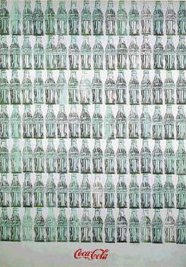
 This album is very simplistic however very impressionable, the eye work to conect with the buyer. It displays the image that they are trying to get through from the band but in a simpistic and effect way. I think i could use the image manipulation on my own artwork, perhaps different part of the body or different eyes like the Beetles cover a hard days night (right), or Warhol's cans(left). I think this creates an artistic look but with the simplicity of simular images working all the time, to portray the band. This also creates the the feel of the history replacing its self which i think is a key look with our band with the music coming from the 70's and 80's style I think this needs to be portrayed and is significant. The
DigiPack Inspiration and Analysis

I think this album cover is really good and the colours and lighting have been chosen work really well together. This sort of colour scheme is something that I think I will go for when choosing my colours as it is simple whilst at the same time being really effective. I also like the angle of the shot and the way it has been framed and placed to the right rather than just being in the middle. Also, the lighting has been carefully considered with the shadows creating a lot of atmosphere within the photo. It has quite a typical layout and font with a photo and the artist name and album title on the bottom of the cover however the colours and image make this normal layout more interesting. Even with a band on the cover I think doing something like this, without the band members looking directly at the camera would work really well in terms of our song and album.

I like the way the artist of this album has been coloured in but the outline is still visible. This adds originality and enables the colour scheme to be really effective. This has inspired me to think about perhaps having a blended out photo of our band on my digipack cover or just have the outline of them with it being filled in with a block of colour, or something similar. I like the layout because it is fairly simple, just an image in the middle and the artist name underneath it, but ot work really well here in terms of the type of album it is. The colours contrast so much that they work well and make each other one stand out well and grab attention. As above, this is a side on shot with the artist not looking down the camera. With the way the photo has been coloured out I don't think it would have had the same effect if the artist was looking down the camera so this works really well. This is a really effective album cover with a simple but interesting font and all aspects of this cover apply to the album and sell it well.

I like the colours and layout of this album cover. I think the writing in the background is really effective and is made to look as though they are her thoughts and this is emphasised by her facial expression. The shot of the photo is really well lit and is framed well. Unconventially, the photo is on the bottom half of the page rather than in the middle but it works for this genre and the writing in the background fits. I like this idea and technique and it is something that I am considering using. I think I would have the band members, similar to this, toward the bottom half of the page and then the song names in the background, or something along those lines, if I went down this route. I like the font chosen and the way that the artists name is a different colour to make it stand out.
DigiPack Inspiration

DigiPack Inspiration

I think this sort of effect if used on my digipack would be really effective and fit in with our song/album theme. Especially in terms of the flashbacks used in our video as this album cover gives an aged effect through the use of black and white and the other effects used. I would need to include the whole band on my cover if I chose to do it this style but I still think the black and white would be a good option. I like the way the image has been placed on the left hand side of the page as it enables the shadow created to give more atmosphere. I like the fonts chosen because the one for the album name and artist are different, they are also very small in the top corners of the page which is unusual, however the image is enough to gain the audience's interest without having to have the album name written in large writing.
DigiPack Inspiration

I really like this digipack cover and the way in which it has been done. This idea is something that would suit our band as it is different to most others and stands out to grab peoples attention. The use of image is the most interesting part of this cover as the pictures of the band members have been taken seperately and then layered on afterwards. This is a fairly conventional layout with the band members in the centre of the page and the band name at the top. However the originality of this design makes the layout more interesting. The bright colours stand out a lot and contrast with the costumes well. Overall I really like the design along with the fonts and techniques used to create it.
DigiPack Inspiration

I like the simplicity and colours used on the front cover of this digipak. I think it is really effective and gives a good idea of the album genre. I think this sort if idea would suit our song and band because it shows isolation which is something that our song is about. I like the way the album names is placed in the middle of the cover on top of the main image as it puts the information all in one place. The colours used suit each other really well and create the right atmosphere for the album genre. Overall I think this is a really good cover but i'm not sure it would fully suit our genre.
Subscribe to:
Comments (Atom)